
001
STARRY UNITED STATES
Citrus Slam
Created for Starry’s Citrus Slam collaboration with Women's National Basketball Association, this concept explored how transparency has become one of the defining cultural values shaping the way Gen Z connects with brands today.
The challenge came from an unusual contradiction: consumers instinctively associate bold flavor with intense visual cues, bright colors, heat, saturation. But what happens when the product itself is completely transparent?
Rather than artificially signaling flavor, the concept leaned into product truth itself, allowing transparency to become the story and letting the product communicate its intensity on its own terms.


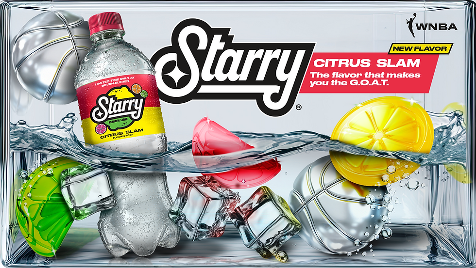
Designer
Karen Naranjo Limón
002
FRITO-LAY UNITED STATES
Valentine's Day
Created for a seasonal Valentine’s Day launch at Frito-Lay, this project explored how packaging design can create interaction long before the product is consumed.
Rather than treating packaging as a purely visual exercise, the concept focused on shared experience in which individual packs were designed to physically connect and form a heart, while integrated messaging invited children to exchange products as part of the celebration itself.
The result turned a simple purchase into something designed for participation, connection, and play.

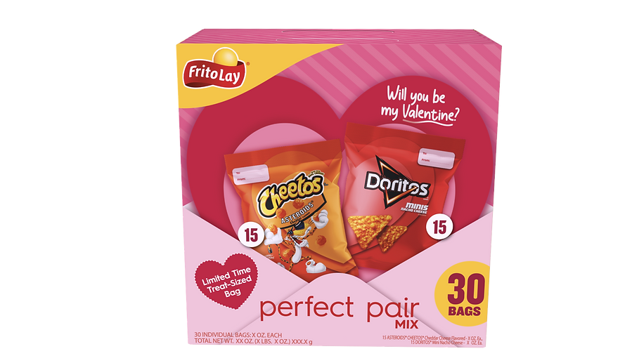
Designer
Karen Naranjo Limón
003
CHEETOS UNITED STATES
Mini Easter
This concept explored how packaging can create curiosity before the product is even opened.
Designed for Frito-Lay’s Easter seasonal edition, the idea drew inspiration from the playful experience of reaching into a claw machine, transforming the cylindrical structure into something interactive and unexpectedly nostalgic.
Through visual depth and layered composition, flat graphics were intentionally designed to create the illusion of dimensionality, making the packaging feel almost transparent, as if filled with stacked Easter eggs waiting to be discovered.


Designer
Karen Naranjo Limón
004
BUGMD UNITED STATES
Bye Bye Mice
This concept explored how thoughtful packaging design can break category expectations by transforming familiar consumer associations into brand identity itself.
Developed for BugMD’s rodent repellent line, the design challenged a visually repetitive category through a simple insight: if cheese naturally attracts mice, what happens when the product itself becomes part of that visual language?
The result combined bold structural design, playful Gen Z-inspired branding, and layered hidden details to create something designed not only to stand out on shelf, but to completely redefine how the category feels.


Designer
Karen Naranjo Limón
005
QUAKER UNITED STATES
The Breakfast Club
This concept explored what happens when product design moves beyond functionality and begins building an entire experience around the ritual itself.
Created for Quaker Oats Company, the project reimagined breakfast preparation through The Breakfast Club, a playful speakeasy-inspired concept where an interactive machine, paired with a custom interface and a fictional host known as The Oatman, turned a simple bowl of oatmeal into a fully branded experience.
The idea challenged a simple assumption: even the most ordinary moments can become memorable when designed with personality and imagination.


Diseñador
Karen Naranjo Limón
006
POPCORNERS UNITED STATES
Love is in the pop!
This project explored how physical interaction can make packaging feel far more memorable before the product is even consumed.
Designed for PopCorners, the concept was built around a simple insight: one of the most meaningful parts of any celebration is the element of surprise. Much like tasting PopCorners for the first time without quite knowing what to expect, the packaging itself was designed to recreate that same sense of anticipation.
The multipack transformed into a balloon-like structure that consumers physically deflate to reveal the product inside, turning the simple act of opening into an experience inspired by the excitement, curiosity, and playful unpredictability of unwrapping a gift from someone special.


